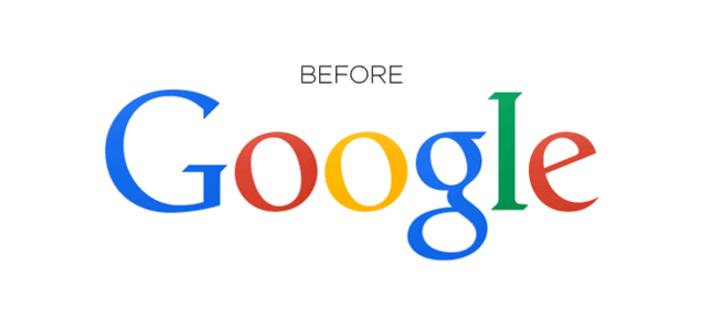
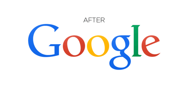
Hands up who noticed Google changing it’s logo over the weekend?
Chances are you didn’t, since it merely moved a few pixels! The big issue that caused much frustration to the global search engine was just two letters being slightly out of line. To fix the problem, Google moved the ‘g’ one pixel to the right and the ‘l’ one pixel down and to the right. It’s the small things! It may not bother the average web user, but for some, ‘kerning’ can be a real issue. It’s staggering how such a huge organisation do not ensure that something as significant as a logo is absolutely perfect first time. It’s also astounding that so many Google nerds’ spotted the change immediately and who then make a point of notifying the branding giant.
Last year Yahoo invited it’s audience to watch the development of their logo change (the first time their logo had changed in 18 years). It used the process as a marketing campaign, called “30 days of change”. In 30 days they displayed one potential logo option on its various sites each day, before the final version was revealed. It wasn’t the most interesting of campaigns, but it allowed the audience to adjust to the change gradually.
“The logo is your calling card, identity, manifestation,” says Chief Marketing Officer Kathy Savitt, “The Yahoo logo is iconic; some people love it, some people hate it. We decided to change it, to reflect new products … and depict our next chapter.”
There’s many cases in which companies attempt to change their logo, which results In a PR disaster. One example is BP, it was over a decade ago that they decided to push a $200 million rebrand. The idea, to bring green connotations to the brand. Rather than simply being ‘BP’, they adopted the tagline ‘Beyond Petroleum’ and included a green ‘Helios’ mark. The idea created controversy and Greenpeace even set up a popular competition for participants to create a parody of the logo.
BP’s logo change (above), One of Greenpeace’s paraody logos (below)
In content marketing, image is everything. An effective logo becomes a language in itself, one image describes your companies purpose and values and can also trigger an emotion. See a golden M and you think of McDonalds - since when did the arches not mean a Maccas?! Apple’s apple – it’s nothing to do with apples, but we associate it with iphones and modern technology. Bizaarely this concept relates back to nature - an insect or bird will use bright, pretty colours to attract a mate…we may not be looking for a partner but we’re always looking for new business. We’re all at it!
You are your business and your business is your brand. It’s amazing to see just how significant the logo is to a brands identity, proven by Google’s sneaky pixel movement!
Lucy Helliwell


