
Rio Tinto uses it. MasterCard uses it too. So does REIWA, the UN and Deloitte. It’s a technology that has been around for decades but has dramatically advanced in usability in just a few short years.
We’re talking about mapping technology. And before you think it’s not needed at your organisation, let’s dig a little deeper. It’s a service that can help to:
-Understand your target audience
-Find out trends
-Analyse your competitors
-Find out which campaigns resulted in consumer purchases
Without getting too technical, it’s analytics on a richer, more visual scale. It gathers data and condenses it into an easy-to-understand and aesthetically pleasing format. Here’s an example from CartoDB that shows where people are the most connected to network and broadband services. This will help telecommunications decide where to place the next hotspot:
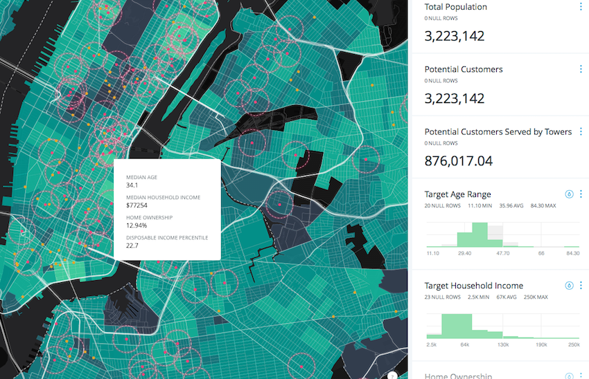
Image credit: CartoDB
Adam Mullett from NGIS, an Australian company that offers these services, explains how it works. CartoDB — a sophisticated information visualisation system — can be used in conjunction with Google maps and your raw data to provide a deep insight into your business and customers. This data could come from sales, social media, sensors or even satellites.
Even if you’re not a large organisation like MasterCard, which undoubtedly has an enormous amount of data, mapping technology is still incredibly useful for any business that has a location element — which is the vast majority of businesses.
Do we need to know which Pacific Islands are going to be affected by climate change first? Do educators need to understand the trends in academic performance? The answer to both is yes, and these are things that mapping visualisation data can show us.
It can be used with less serious topics too. Recently, the LA Times produced a map of every shot ever taken by Kobe Bryant (a basketball player for those wondering). The newspaper used around 30,699 data points to show this fascinating graphic:
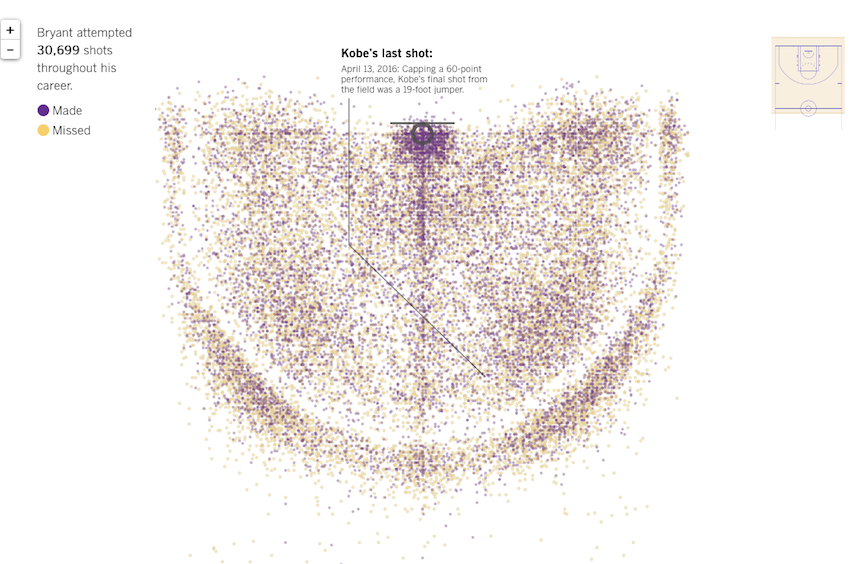
Image Credit: The LA Times
Real-life examples:
- Real estate
The Real Estate Institute of WA could have just rested on its laurels and used a standard static map to show where properties are located for the 400,000 people who visit their website each month.
Instead, REIWA has an interactive service that allows users to see not just the property specifics but also easy-to-use maps to toggle on and off other services such as water meters, sewer pipes, schools, entertainment and the emergency services nearby. There’s also an interactive map that analyses entire suburbs, with sales hot spots, time spent on market and housing growth.
- Area management
Sydney Olympic Park Authority is the NSW Government agency that looks after $1.8 billion of infrastructure including sporting venues and parklands. The Authority wanted to improve awareness about road closures and points of interest, reduce congestion and help people plan their journeys on their maps.
NGIS created a service to do just this, which reduced the need for physical maps and contained up-to-the-minute information, in both desktop and app format for all visitors to the area.
- Tourism
How many German travellers are arriving compared with Brits? Do the Chinese eat more in restaurants than Americans? Are visitors spending more money in one city, and why? A company in the tourism industry would no doubt love to know when and where tourists are spending their time and money.
BBVA, a Spanish banking group, teamed up with Vizzuality to understand tourist behaviour in Spain. They did this using credit card transaction analysis during peak holiday season. Plenty of interesting – even surprising – insights emerged from this. Australian tourists, for example, spend more on Mondays and Tuesdays in Spain, and spent 41 per cent of their money on fashion, while just 12 per cent was sunk into restaurants. You may not have thought that would be the case, would you?
- Automotive
A common problem of many companies is the decision on where to advertise their services and to whom precisely. A Western Australian car servicing company wondered where to do a marketing leaflet drop to their customers, but they were unsure where to do it most effectively. They used their data to find out that, in fact, their customers were spread far and wide.
Looking a little deeper into the personalised data map though, they realised their customers had a distinct behaviour: they tended to drop their car off to a service provider near where they worked — not where they lived. This helped the car servicing company create a campaign that targeted local businesses clustered around their service centres.
NGIS’ Adam Mullet recently spoke with Brand Newsroom about how data visualisation can assist content marketing. Listen to the podcast here.
To find out more or see how data visualisation can work for your company, visit NGIS here or see CartoDB here.


